

A great label goes a long way towards making a sale. Beers, wines and spirits with eye-catching labels are more likely to land in a customer’s order. These labels have also significantly evolved in look and feel with the rise of the craft industry.
For more insight into modern trends in alcohol labels, we recently spoke with Jared Powell. He’s principal at Frontier Label, a custom label printer out of Greenville, SC. Frontier Label has worked with around 100 wineries, more than 50 breweries and about a dozen distilleries, mostly in the craft space.
Kyle Swartz: Why are labels as important as ever?

Jared Powell: The industry, craft beer especially, is really exploding, so more and more people are trying beers and brands they’ve never had before. They’re more interested in exploring outside of the Budwesiers of the world. But they don’t know these beers. They don’t have a lot of knowledge to judge them by.
So the label is really going to make a difference. When customers are perusing the shelf at a retailer or pub, the label will make or break their decision. The artwork needs to connect with them, because that’s all they have to go on.
KS: How can artwork connect with modern consumers?
JP: Different elements appeal to different people, of course. In craft beer we’re seeing a lot of high-quality artwork that can go one of two different ways. Either it’s real elegant and clean, or it has a lot more colors than in the past, bright artwork with a glossy laminate. Those both appeal to customers and we’re seeing more and more of it. It’s been a dramatic shift.
KS: What about wine?
JP: Wine labels have not changed as much as with craft beer. We still see a lot of people going for a clean, upscale aesthetic. But a handful have started to branch out. They’re trying out metallic, holograms, cutting-edge things that really stand out.

KS: Have these modern labels been effective in wine?
JP: I’d say so, based on how many labels like this the producers have ordered from us. Look at a wine shelf today and what do you see? Paper label with embossing, paper label with embossing, paper label with embossing — and then boom you see something shiny and metallic. Those types of labels seem to have done well in capturing the customer’s attention.
KS: How about with spirits?
JP: We recently worked with a local distillery that had started off printing paper labels. We tweaked their artwork a bit and moved to a metallic label with a really cool blue. They’ve stuck with it and have been buying a lot of those labels.
KS: How has the canning movement contributed to this?
JP: Cans have really given label artists more space to work with. On a beer bottle, you might have four-to-seven inches to work with. On a can you definitely have room for the artist to come up with great, cool designs.
KS: We see labels now tap into augmented reality and other ways of connecting with consumers through digital apps. Thoughts?
JP: It’s an emerging movement. We’ve not yet seen demand for it from our customers. But we have played around a little bit with it and done some research into our capabilities. We could do it but it’s not something we’re marketing yet. I’m not quite sure this trend is here yet, but maybe in another year or two, when more brands catch on to what they can do with it.
KS: How else have labels evolved?
JP: Early on, when we first started printing labels for craft beer breweries, a lot of the label designs were really marketed towards men. These designs were what I would call overtly masculine. A lot of cartoony images. Now we’re really seeing a trend away from that.
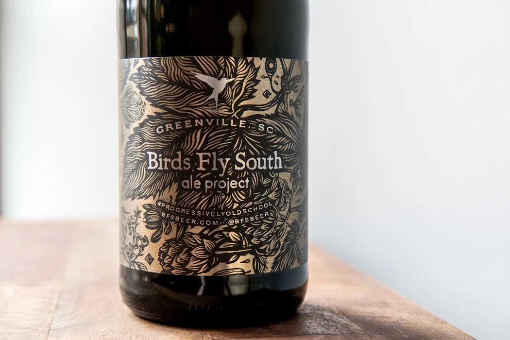
More breweries have realized that women can enjoy craft beer as much as men. And because of that, we’re seeing more and more labels that are simple, elegant, and female-friendly. One of our craft brewers, called Birds Fly South, recently worked with a local artist on a label that has great floral elements. We printed this on a metallic label, and it looks great. The ladies in our office really love that design.
We really are seeing a major shift in craft beer away from it being just for men, and more towards women as well.
Kyle Swartz is an editor of Beverage Wholesaler. Reach him at kswartz@epgmediallc.com or on Twitter @kswartzz. Read his recent piece 11 Trends Defining Craft Beer in 2018.


